library(janitor)
library(readxl)
library(sf)
library(stargazer)
library(tidyverse)COVID-19 Deaths in North Carolina: Exploratory Data Analysis
r
tidyverse
data cleaning
public health
In this project, I am going to be conducting an exploratory data analysis working with COVID-19 data from Johns Hopkins University. The data can be found on GitHub with some discussion and context on the JHU Coronavirus Resource Center website. I will be plotting that data geographically and bringing in other data sources to explore the relationship between COVID death rates and other demographic, socioeconomic, and health factors. This type of analysis could go on indefinitely until I run out of variables, so I will limit myself to just a few. Note that the purpose of this post is to explore the data and a few relationships and trends, and to demonstrate with R code how to summarize, visualize, and quantify these patterns. I am not attempting to build a predictive model or train an algorithm on this data.
I’ll go ahead and load in the packages I will be using.
Deaths By County
Deaths Data Set
First, read the data on death counts.
deaths <- read_csv("time_series_covid19_deaths_US.csv", show_col_types = FALSE)I need to convert this very wide dataset, which has a column for each day, into a long dataset with a date variable and a deaths variable. I know that I will only be working with North Carolina data, so I can filter down to that. I also convert date into an actual date type and trim off some extraneous columns, as well as cleaning up variable names. I also need to make FIPS into a character type.
deaths_long <- deaths |>
  filter(Province_State == "North Carolina") |>
  pivot_longer(
    cols = matches(r"(\d{1,2}/\d{1,2}/\d{2})"),
    names_to = "date",
    values_to = "deaths"
  ) |>
  mutate(
    date = as_date(date, format = "%m/%d/%y"),
    FIPS = as.character(FIPS)
  ) |>
  clean_names() |>
  rename(
    county = admin2,
    state = province_state
  ) |>
  select(fips, county, state, population, date, deaths)
To get a bit better sense of what this data set looks like, I first zoom in on my hometown’s Henderson County, NC.
henderson_county <- deaths_long |>
  filter(county == "Henderson")
I can make a quick plot of deaths over time.
ggplot(henderson_county, aes(x = date, y = deaths)) +
  geom_line() +
  labs(x = "Date", y = "Deaths")
This shows us that the deaths variable is the cumulative total deaths over time, not new deaths reported at each data point.
County Borders
I got the GeoJSON file with the state and county borders from NC One Map.
borders <- read_sf("nc_borders.geojson") |>
  clean_names()
Just a quick look at the map that provided:
ggplot(borders) + geom_sf() + theme_bw()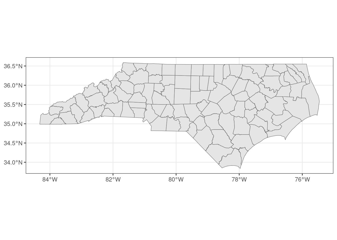
In the COVID deaths data frame, FIPS codes are listed with state concatenated with county, but the borders data frame only lists the county. In order to be able to join the two together, I add the state FIPS code onto the borders data frame:
borders <- borders |>
  mutate(fips = paste0("37", fips))
Next, I want to get the overall total deaths for each county. I take the most recent date of data, because the death numbers reported are cumulative. I then calculate the number of deaths per thousand residents.
total_deaths <- deaths_long |>
  slice_max(date) |>
  mutate(deaths_per_thousand = (deaths / population) * 1000)
Joining the deaths data frame with the borders data frame:
joined_deaths_and_borders <- borders |>
  inner_join(
    total_deaths,
    by = "fips"
  )
Results
Finally, I can plot the deaths per thousand over the map of NC counties.
ggplot(joined_deaths_and_borders, aes(fill = deaths_per_thousand)) +
  geom_sf() +
  scale_fill_distiller(palette = "YlOrRd", direction = 1) +
  labs(fill = "Deaths per\nthousand residents") +
  theme_bw()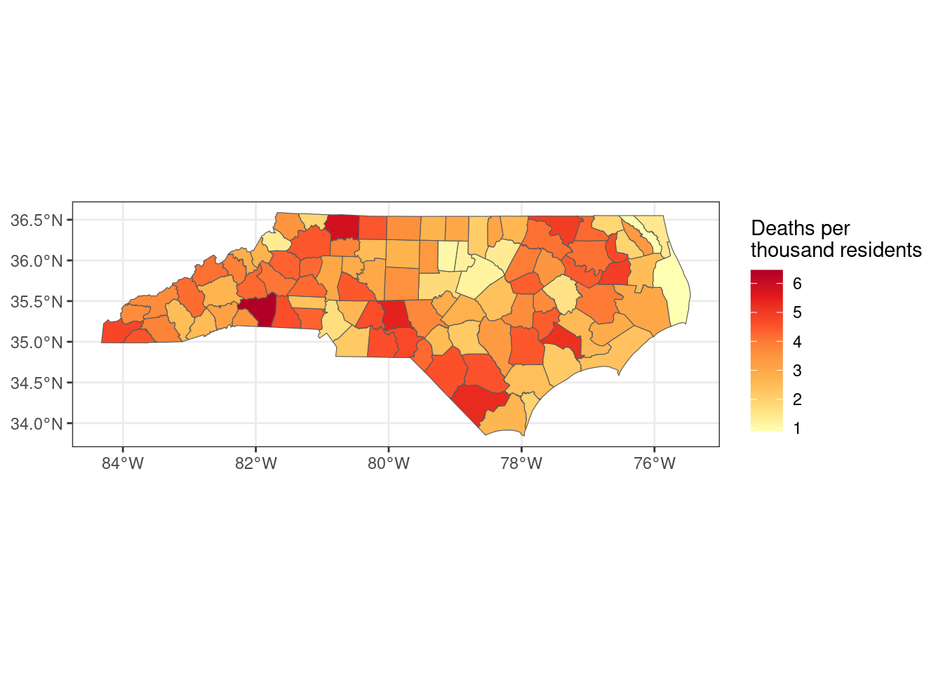
Which counties had the most deaths per thousand residents?
total_deaths |>
  slice_max(deaths_per_thousand, n = 10) |>
  select(county, deaths_per_thousand)
# A tibble: 10 × 2
county deaths_per_thousand
<chr> <dbl>
1 Rutherford 6.46
2 Surry 5.86
3 Montgomery 5.45
4 Columbus 5.30
5 Jones 5.20
6 Northampton 4.98
7 Washington 4.92
8 Cherokee 4.79
9 Chowan 4.73
10 Richmond 4.73Which counties had the fewest?
total_deaths |>
  slice_min(deaths_per_thousand, n = 10) |>
  select(county, deaths_per_thousand)
# A tibble: 10 × 2
county deaths_per_thousand
<chr> <dbl>
1 Dare 0.892
2 Camden 0.920
3 Orange 1.06
4 Wake 1.18
5 Durham 1.23
6 Franklin 1.38
7 Watauga 1.39
8 Currituck 1.44
9 Pitt 1.59
10 Mecklenburg 1.70 Median Income
I got data on unemployment and household income from the USDA Economic Research Service. I downloaded it in .xlsx format because the csv somehow didn’t contain the same data. Even though I have the data for unemployment available, I am not going to consider that in this exploratory analysis. COVID lockdowns and the economic fallout of the pandemic had very obvious impacts on unemployment, but the relationship is more complicated than what I think I can accomplish here with the data that I have. So I will just be looking at median income by county for 2021. I will filter out the statewide total.
income <- read_excel("UnemploymentReport.xlsx", skip = 2) |>
  clean_names() |>
  select(fips, name, median_household_income_2021) |>
  rename(median_income = median_household_income_2021) |>
  filter(name != "North Carolina")
I can first get some summary statistics to get a sense of the distribution of the data..
summary(income$median_income) Min. 1st Qu. Median Mean 3rd Qu. Max.
38613 45556 52680 55008 60517 91558 For the histogram, I include a reference line for the average median income.
ggplot(income, aes(x = median_income)) +
  geom_histogram(binwidth = 2500, color = "black") +
  geom_vline(aes(xintercept = mean(median_income), color = "mean")) +
  scale_color_manual(name = "Reference", values = c(mean = "red")) +
  labs(x = "Median Income", y = "Count")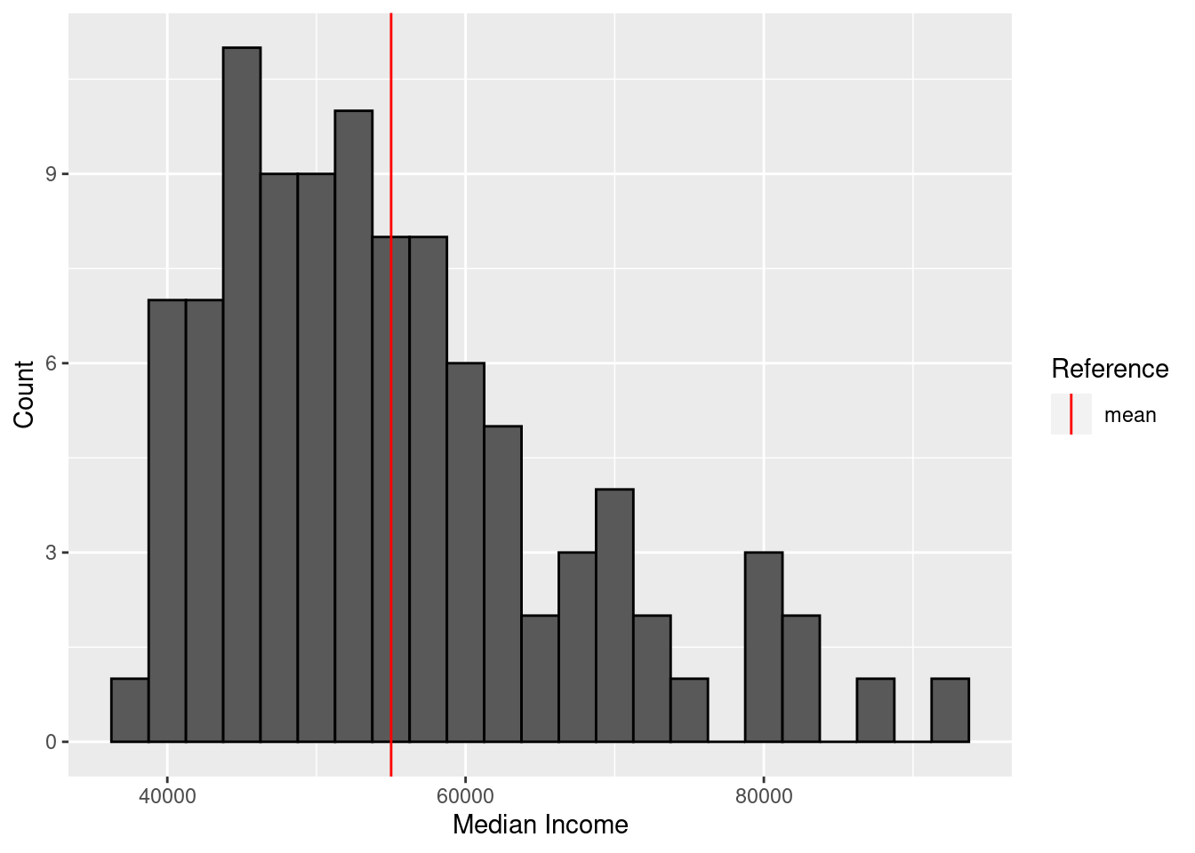
Next, I can plot median income by county.
full_join(borders, income, by = "fips") |>
  ggplot(aes(fill = median_income)) +
  geom_sf() +
  labs(fill = "Median Income") +
  theme_bw()
Which counties have the highest median income?
income |>
  slice_max(median_income, n = 10) |>
  select(name, median_income)
# A tibble: 10 × 2
name median_income
<chr> <dbl>
1 Wake County, NC 91558
2 Union County, NC 87553
3 Chatham County, NC 82764
4 Currituck County, NC 82759
5 Orange County, NC 79814
6 Camden County, NC 79162
7 Cabarrus County, NC 79148
8 Mecklenburg County, NC 75138
9 Lincoln County, NC 73319
10 Durham County, NC 71436And the lowest?
income |>
  slice_min(median_income, n = 10) |>
  select(name, median_income)
# A tibble: 10 × 2
name median_income
<chr> <dbl>
1 Robeson County, NC 38613
2 Halifax County, NC 38944
3 Tyrrell County, NC 39970
4 Hertford County, NC 40461
5 Northampton County, NC 40524
6 Anson County, NC 40773
7 Edgecombe County, NC 41157
8 Columbus County, NC 41206
9 Bertie County, NC 41280
10 Richmond County, NC 42158I am curious whether there is a relationship between death counts and median income. To examine that, I will need to join the data sets.
deaths_and_income <- inner_join(
  total_deaths,
  income,
  by = "fips"
)
I can do a plot of income versus death rate:
ggplot(deaths_and_income, aes(x = median_income, y = deaths_per_thousand)) +
  geom_point() +
  geom_smooth(method = "lm") +
  labs(x = "Median Income", y = "Deaths per Thousand Residents")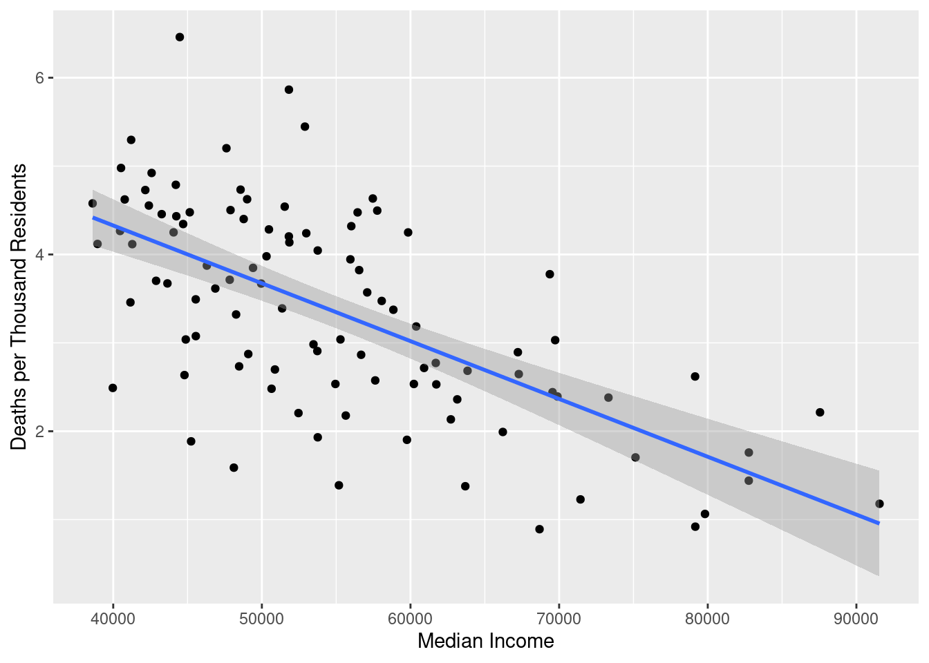
There is a pretty clear negative correlation between median income and coronavirus death rate. We can quantify this using a simple regression model:
model_death_income <- lm(
  deaths_per_thousand ~ median_income,
  data = deaths_and_income
)
stargazer(model_death_income, type = "html")| Dependent variable: | |
| deaths_per_thousand | |
| median_income | -0.0001*** |
| (0.00001) | |
| Constant | 6.945*** |
| (0.443) | |
| Observations | 100 |
| R2 | 0.413 |
| Adjusted R2 | 0.407 |
| Residual Std. Error | 0.916 (df = 98) |
| F Statistic | 69.060*** (df = 1; 98) |
| Note: | p<0.1; p<0.05; p<0.01 |
The results are a bit hard to make sense of because the unit of median_income is dollar, and so the coefficient on that term tells us the predicted change in deaths_per_thousand per one additional dollar of income. That is a very small scale. Just to make it a little easier to parse, I will adjust the model to regress on median income in tens of thousands of dollars. That way, the coefficient will represent predicted change in death rate per additional $10,000 dollars.
model_death_income_adjusted <- lm(
  deaths_per_thousand ~ I(median_income / 10000),
  data = deaths_and_income
)

stargazer(model_death_income_adjusted, type = "html")| Dependent variable: | |
| deaths_per_thousand | |
| I(median_income/10000) | -0.654*** |
| (0.079) | |
| Constant | 6.945*** |
| (0.443) | |
| Observations | 100 |
| R2 | 0.413 |
| Adjusted R2 | 0.407 |
| Residual Std. Error | 0.916 (df = 98) |
| F Statistic | 69.060*** (df = 1; 98) |
| Note: | p<0.1; p<0.05; p<0.01 |
We can interpret this as saying that for a change in median income of $10,000, the average death rate per thousand residents decreases by 0.65. Given that the entire range of the death rate variable covers just 0.9 to 6.5, that’s a substantial association. This is obviously a very simple model that doesn’t control for other variables, but it is an interesting first pass at that correlation.
Health and Social Factors
I downloaded a large dataset from the North Carolina Institute of Medicine, which you can download here. As is the case with many publicly available data spreadsheets, it was made more for humans to read than for machines to read, so it will take some cleaning up to use. I want to skip the first row so that I can use the second row which has all of the county names as the column labels, but that will require me to manually name the first few columns myself.
health_data <- read_excel("county_health_data_2021.xlsx", skip = 1)
names(health_data)[1:7] <- c(
  "indicator_category",
  "indicator_name",
  "indicator_descriptor",
  "source_label",
  "source_link",
  "blank",
  "nc"
)
I think for the most part I will be pulling individual indicators out of this data and then pivoting the row from wide to long. There are too many variables in this spreadsheet to include all of them in this post, so I will be focusing on three that I think will be particularly interesting: elderly population, concentration of primary care physicians, and adult smoking prevalence.
Elderly Population
The first that I would like to look at is elderly population, which is the percent of the population aged 65 or older. I expect the percentage of elderly residents to be positively correlated with COVID-19 deaths, because they are among the most vulnerable populations.
elderly_pop <- health_data |>
  filter(indicator_name == "Elderly Population") |>
  pivot_longer(
    cols = -c(1:7),
    names_to = "county",
    values_to = "elderly_pop"
  ) |>
  select(county, elderly_pop) |>
  filter(!(county %in% c("Data year", "Data Notes"))) |>
  mutate(elderly_pop = as.numeric(elderly_pop))
What do the elderly population numbers look like?
summary(elderly_pop$elderly_pop) Min. 1st Qu. Median Mean 3rd Qu. Max.
0.0960 0.1718 0.2030 0.2056 0.2367 0.3260 ggplot(elderly_pop, aes(x = elderly_pop)) +
geom_histogram(binwidth = 0.01, color = "black") +
geom_vline(aes(xintercept = mean(elderly_pop), color = "mean")) +
scale_color_manual(name = "Reference", values = c(mean = "red")) +
labs(x = "% Elderly Population", y = "Count")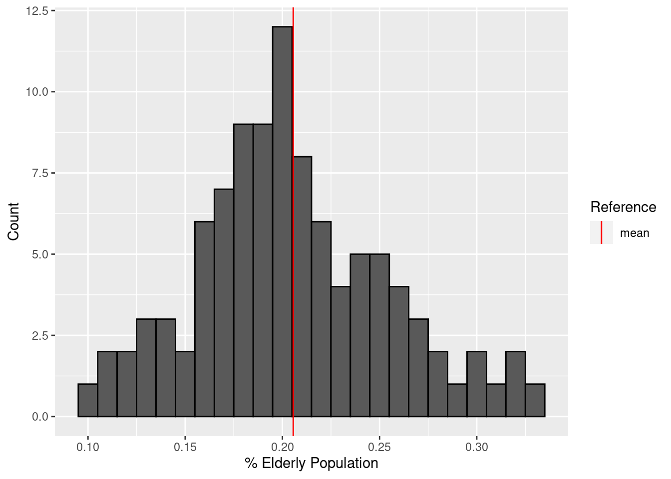
I can make a quick map of that data by combining this data frame with borders.
borders |>
  inner_join(elderly_pop, by = "county") |>
  ggplot(aes(fill = elderly_pop)) +
  labs(fill = "% Elderly Population") +
  geom_sf() +
  theme_bw()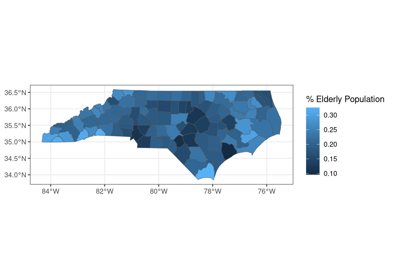
I will join elderly_pop onto total_deaths to see how well elderly population correlates with COVID deaths:
joined_deaths_and_elderly <- inner_join(
  total_deaths,
  elderly_pop,
  by = "county"
)

ggplot(joined_deaths_and_elderly, aes(x = elderly_pop, y = deaths_per_thousand)) +
  geom_point() +
  geom_smooth(method = "lm") +
  labs(x = "% Elderly Population", y = "Deaths per 1,000")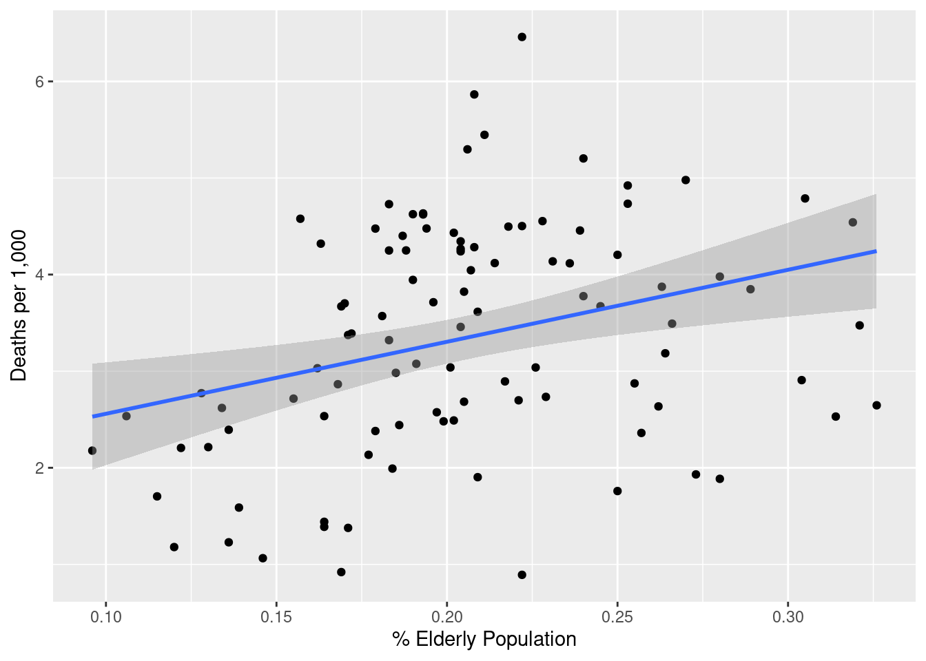
How strong is that relationship? I will convert the decimal elderly_pop into a percentage to make interpreting the coefficients simpler.
lm(deaths_per_thousand ~ I(elderly_pop * 100), data = joined_deaths_and_elderly) |>
stargazer(type = "html")| Dependent variable: | |
| deaths_per_thousand | |
| I(elderly_pop * 100) | 0.075*** |
| (0.023) | |
| Constant | 1.814*** |
| (0.486) | |
| Observations | 100 |
| R2 | 0.097 |
| Adjusted R2 | 0.088 |
| Residual Std. Error | 1.137 (df = 98) |
| F Statistic | 10.515*** (df = 1; 98) |
| Note: | p<0.1; p<0.05; p<0.01 |
A fairly strong positive association: for an increase in elderly population of one percentage point, we can expect an addition 0.075 COVID deaths per thousand residents, with p < 0.01.
Physician Concentration
We also have data on number of primary care physicians per 10,000 population. I expect that to be strongly negatively correlated with COVID deaths. I also expect that the areas with the highest physician concentration will be clustered around the Triangle and Charlotte, with upticks in Forsyth County and Pitt County where other medical schools are. It wouldn’t surprise me if Buncombe and maybe New Hanover Counties are also high.
physicians <- health_data |>
  filter(indicator_name == "Health Care Workforce - Primary Care Physicians") |>
  pivot_longer(
    cols = -c(1:7),
    names_to = "county",
    values_to = "physicians"
  ) |>
  select(county, physicians) |>
  filter(!(county %in% c("Data year", "Data Notes"))) |>
  mutate(physicians = as.numeric(physicians))
Let’s take a look at the general distribution of physicians.
summary(physicians$physicians) Min. 1st Qu. Median Mean 3rd Qu. Max.
0.000 3.500 4.900 5.266 6.400 22.100 ggplot(physicians, aes(x = physicians)) +
geom_histogram(binwidth = .5, color = "black") +
geom_vline(aes(xintercept = mean(physicians), color = "mean")) +
scale_color_manual(name = "Reference", values = c(mean = "red")) +
labs(x = "Primary Care Providers per 10k", y = "Count")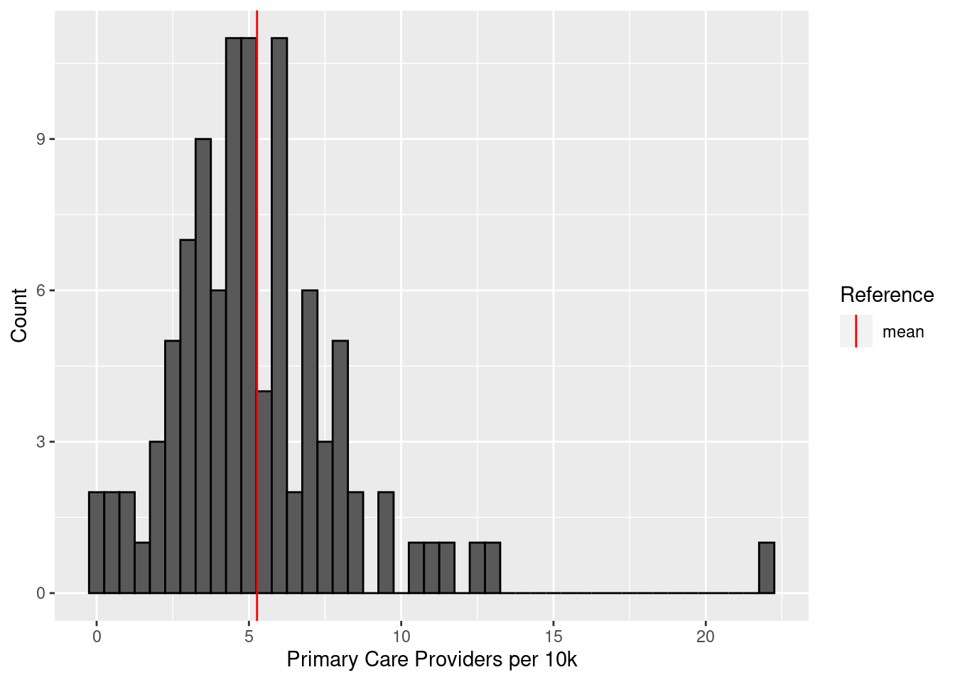
There’s a very clear outlier – what exactly are the counties with the highest primary care presence?
physicians |>
  slice_max(physicians, n = 10)
# A tibble: 10 × 2
county physicians
<chr> <dbl>
1 Orange 22.1
2 Buncombe 13
3 Durham 12.6
4 Forsyth 11.4
5 Pitt 11.1
6 Swain 10.5
7 Hertford 9.6
8 Mecklenburg 9.5
9 Mitchell 8.5
10 Wake 8.5I was right about the Triangle, Charlotte, and Asheville, but Wilmington’s New Hanover County doesn’t make the top ten.
borders |>
  inner_join(physicians, by = "county") |>
  ggplot(aes(fill = physicians)) +
  geom_sf() +
  labs(fill = "Primary Care\nProviders per 10k") +
  theme_bw()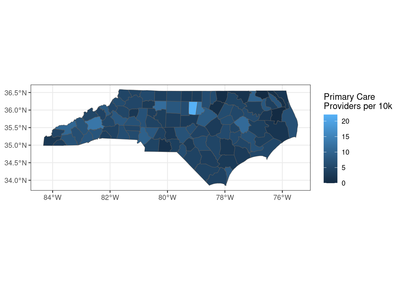
Let’s see how the correlation between physician presence and COVID deaths looks:
joined_deaths_and_physicians <- inner_join(
  total_deaths,
  physicians,
  by = "county"
)

ggplot(joined_deaths_and_physicians, aes(x = physicians, y = deaths_per_thousand)) +
  geom_point() +
  geom_smooth(method = "lm") +
  labs(x = "Primary Care Providers per 10k", y = "Deaths per 1,000")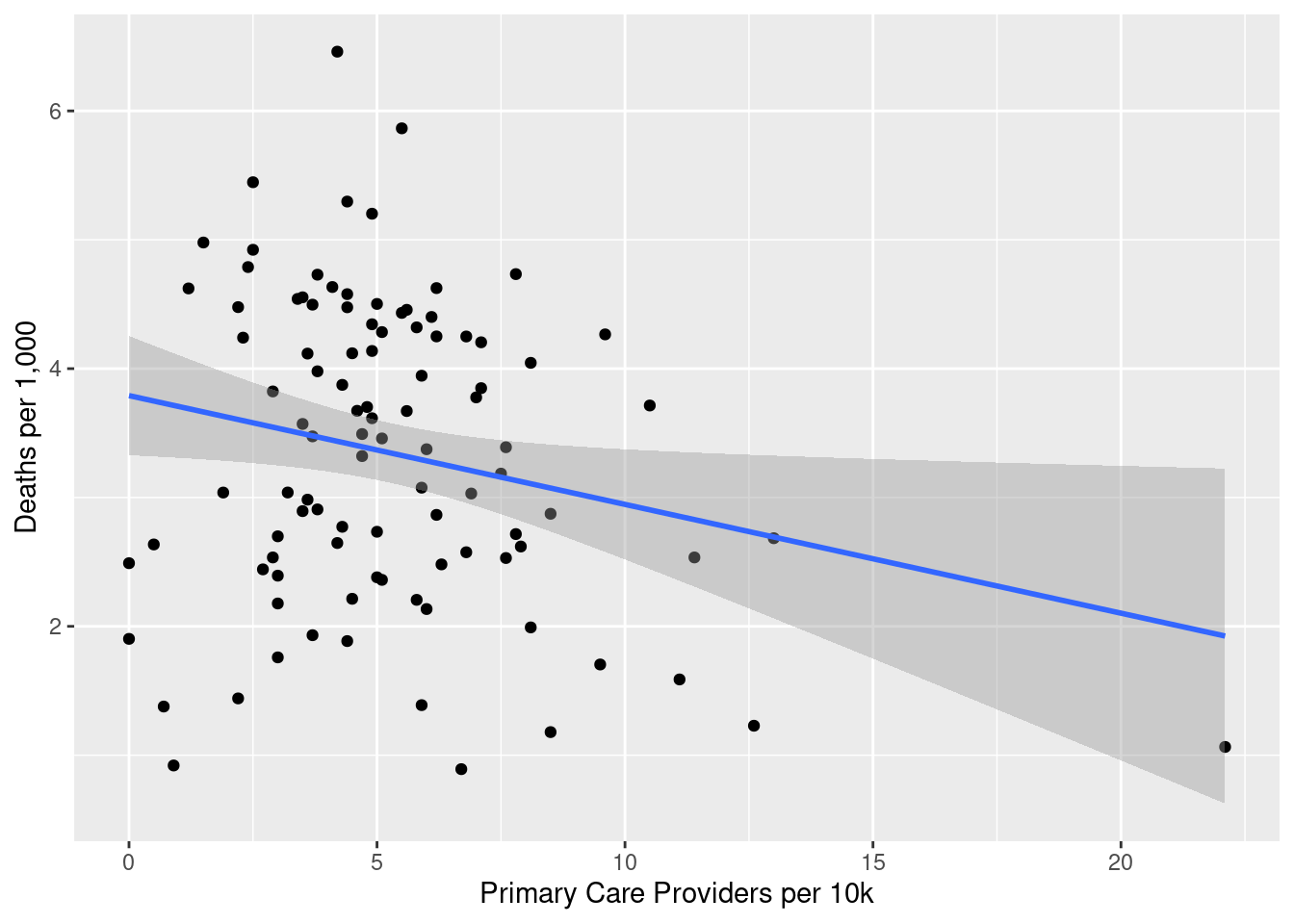
That is a fairly negative association, but it looks Orange County may have disproportionate leverage on that finding. What does it look like without Orange County?
joined_deaths_and_physicians |>
  filter(county != "Orange") |>
  ggplot(aes(x = physicians, y = deaths_per_thousand)) +
  geom_point() +
  geom_smooth(method = "lm") +
  labs(x = "Primary Care Providers per 10k", y = "Deaths per 1,000")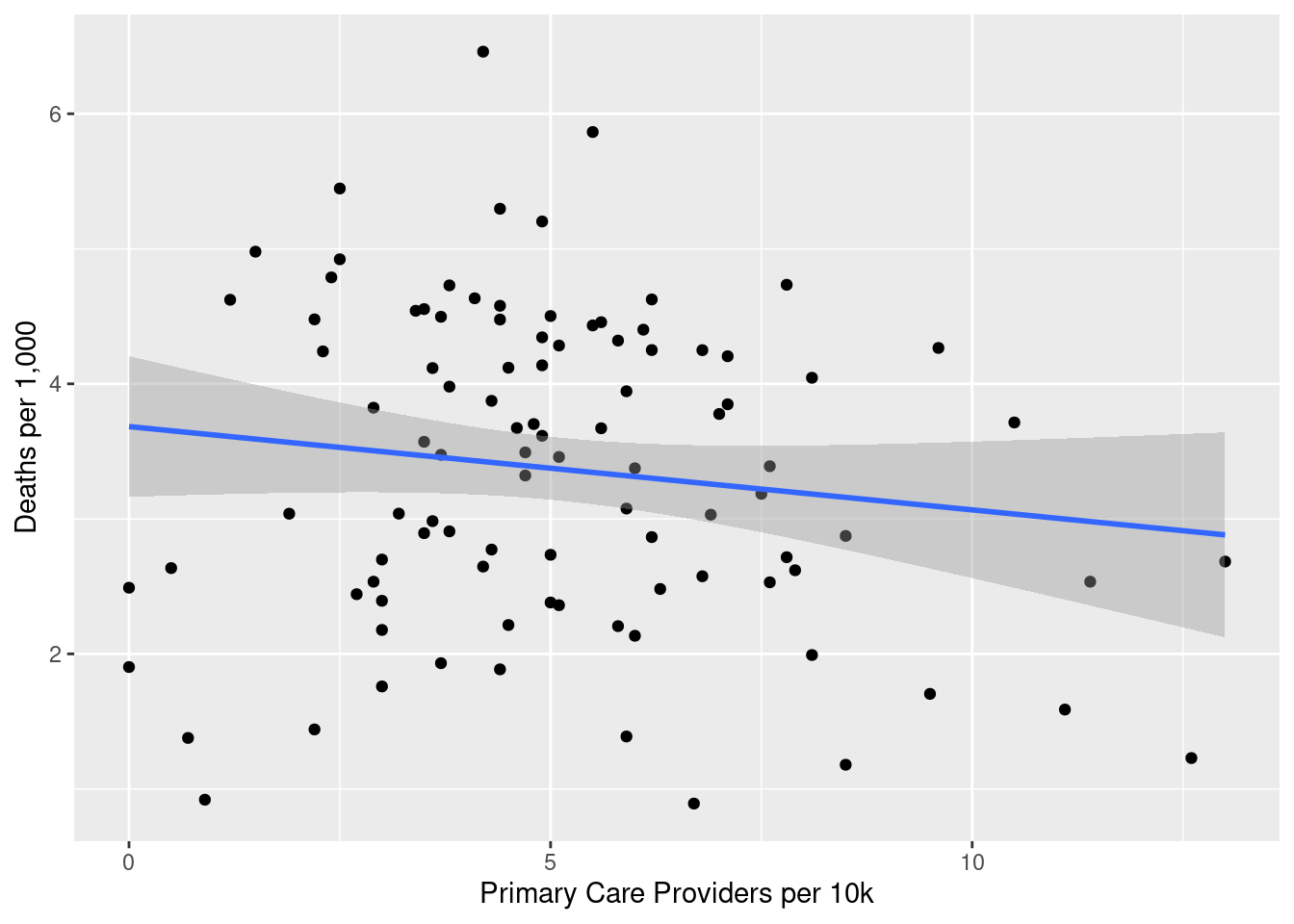
Without Orange County, the line looks much flatter, and the confidence interval is such that we can’t necessarily rule out a null result. What do the regression numbers look like?
lm(
  deaths_per_thousand ~ physicians,
  data = joined_deaths_and_physicians
) |>
stargazer(type = "html")| Dependent variable: | |
| deaths_per_thousand | |
| physicians | -0.084** |
| (0.038) | |
| Constant | 3.791*** |
| (0.233) | |
| Observations | 100 |
| R2 | 0.047 |
| Adjusted R2 | 0.038 |
| Residual Std. Error | 1.168 (df = 98) |
| F Statistic | 4.860** (df = 1; 98) |
| Note: | p<0.1; p<0.05; p<0.01 |
As we could tell visually, not a strong association. I expect that removing Orange County will weaken it further:
exclude_oc <- lm(
  deaths_per_thousand ~ physicians,
  data = filter(joined_deaths_and_physicians, county != "Orange")
  )
stargazer(exclude_oc, type = "html")| Dependent variable: | |
| deaths_per_thousand | |
| physicians | -0.062 |
| (0.046) | |
| Constant | 3.683*** |
| (0.263) | |
| Observations | 99 |
| R2 | 0.018 |
| Adjusted R2 | 0.008 |
| Residual Std. Error | 1.169 (df = 97) |
| F Statistic | 1.793 (df = 1; 97) |
| Note: | p<0.1; p<0.05; p<0.01 |
This one really surprised me. I definitely expected a fairly robust correlation between PCP presence and COVID deaths. I am curious how the model would look if we controlled for elderly population.
control_for_elderly <- lm(
  deaths_per_thousand ~ physicians + elderly_pop,
  data = inner_join(elderly_pop, joined_deaths_and_physicians, by = "county")
)
stargazer(control_for_elderly, type = "html")| Dependent variable: | |
| deaths_per_thousand | |
| physicians | -0.059 |
| (0.038) | |
| elderly_pop | 6.597*** |
| (2.346) | |
| Constant | 2.303*** |
| (0.575) | |
| Observations | 100 |
| R2 | 0.119 |
| Adjusted R2 | 0.101 |
| Residual Std. Error | 1.129 (df = 97) |
| F Statistic | 6.554*** (df = 2; 97) |
| Note: | p<0.1; p<0.05; p<0.01 |
physicians doesn’t become significant even after controlling for elderly population. I must say I’m surprised by this, I really expected a strong relationship. But that’s why we look at data – to hopefully be surprised.
Adult Smoking
smokers <- health_data |>
  filter(indicator_name == "Adult Smoking") |>
  pivot_longer(
    cols = -c(1:7),
    names_to = "county",
    values_to = "smokers"
  ) |>
  select(county, smokers) |>
  filter(!(county %in% c("Data year", "Data Notes"))) |>
  mutate(smokers = as.numeric(smokers) * 100)
Summary statistics:
summary(smokers$smokers) Min. 1st Qu. Median Mean 3rd Qu. Max.
12.0 16.0 17.5 17.5 19.0 24.0 ggplot(smokers, aes(x = smokers)) +
geom_histogram(binwidth = 1, color = "black") +
geom_vline(aes(xintercept = mean(smokers), color = "mean")) +
scale_fill_manual(name = "Reference", values = c(mean = "red")) +
labs(x = "Adult Smokers (%)", y = "Count")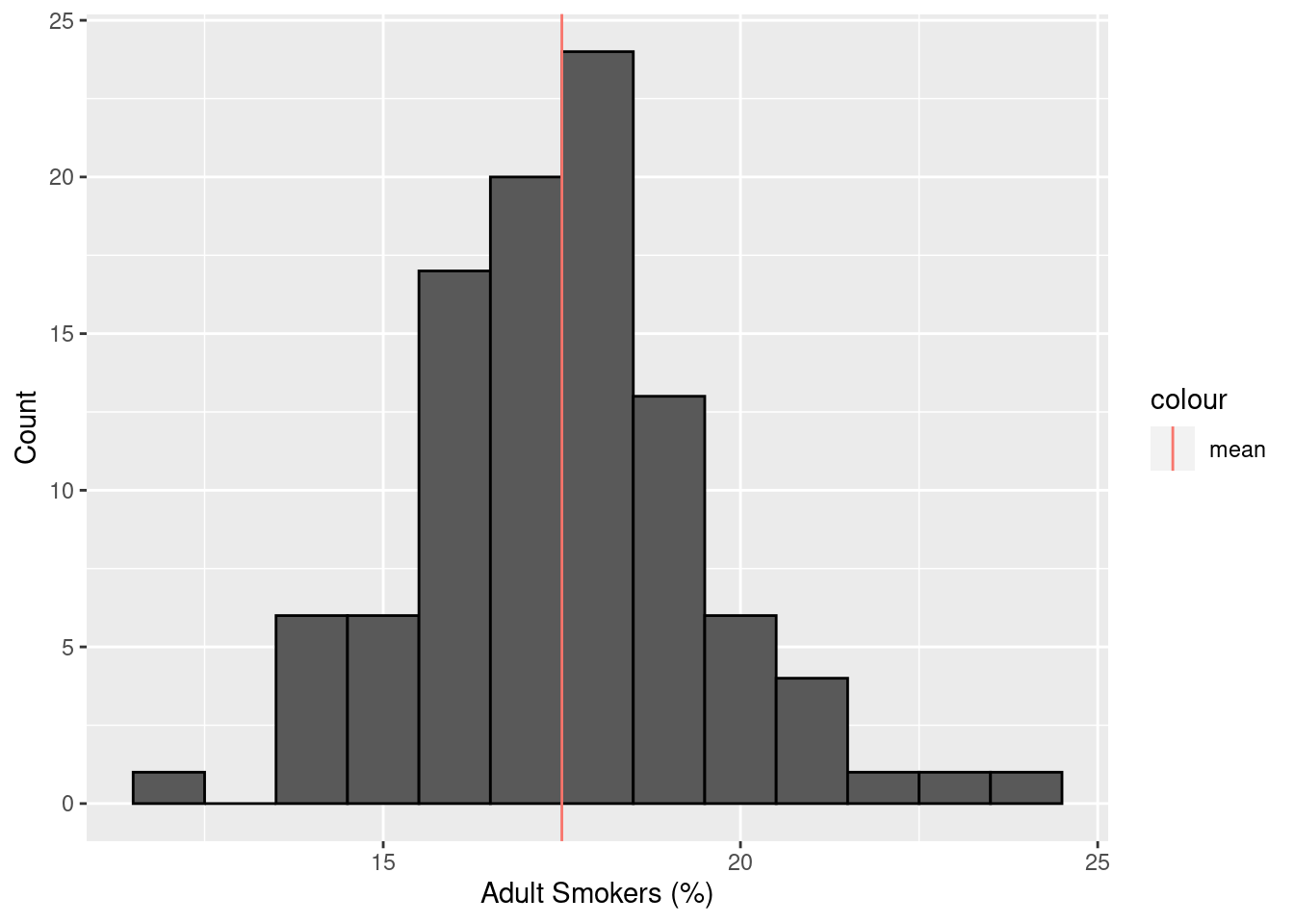
Mapping smoking prevalence:
borders |>
  inner_join(smokers, by = "county") |>
  ggplot(aes(fill = smokers)) +
  geom_sf() +
  labs(fill = "Adult Smoking (%)") +
  theme_bw()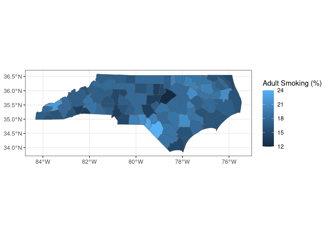
What is the correlation between smoking prevalence and COVID deaths? I expect there to be a very clear positive relationship.
joined_deaths_and_smokers <- inner_join(
  total_deaths,
  smokers,
  by = "county"
)

ggplot(joined_deaths_and_smokers, aes(x = smokers, y = deaths_per_thousand)) +
  geom_point() +
  geom_smooth(method = "lm") +
  labs(x = "Adult Smokers (%)", y = "Deaths per 1,000")
The trend is very clear visually. Quantitatively:
model_death_smokers <- lm(
  deaths_per_thousand ~ smokers,
  data = joined_deaths_and_smokers
)
stargazer(model_death_smokers, type = "html")| Dependent variable: | |
| deaths_per_thousand | |
| smokers | 0.271*** |
| (0.053) | |
| Constant | -1.392 |
| (0.939) | |
| Observations | 100 |
| R2 | 0.208 |
| Adjusted R2 | 0.200 |
| Residual Std. Error | 1.064 (df = 98) |
| F Statistic | 25.813*** (df = 1; 98) |
| Note: | p<0.1; p<0.05; p<0.01 |
As expected, there is a strong positive relationship between smoking prevalence and COVID death rate. In this case, an increase in adult smoking prevalence of one percentage point is associated with an increase in COVID death rate of 0.27 deaths per 1,000 individuals.
Conclusion
This has been a really interesting and fun exercise. In general, the relationships that I examined were not particularly surprising, but I was shocked to see that there was no significant relationship between physician concentration and COVID death rate. It’s worth thinking about why that might be the case and exploring the relationship between primary care and severe acute health outcomes. In the future, I may revisit these data sets to build a machine learning model to predict COVID death rate from these and other covariates. Thanks for reading!